
Pecking Bird-call Nocturne score –
Reformatting quite a chore –
Leaves no time on blogs to fritter,
So I’ll get by with a Twitter!
Favour asked: in previous post
Say which cover you like most?
Comment on what’s good and bad –
For all feedback I’ll be glad.

Left – SA edition. Right – USA proof.
And, while here, please also log
Captions for the seated dog;
Brilliant ones already there –
But don’t let that bring despair!

(Gorgeously attractive Please, coated wif choice chocolate sprinkles?)


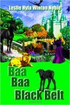


I like the first book cover, definitely not the font of the US version…
LikeLike
Thanks for opinion!
(Wish everyone had the same one, though!) 🙂
LikeLike
I prefer the first cover. I like the colour of her hair better, and the darker cat looks far more mysterious.Your name is much better all in one line.
LikeLike
The second book cover appeals more to my eye…it looks fresher and crisper.
LikeLike
Thanks for that – if I can iron out the undoubted faults …
LikeLike
I also like how the white cat stands out. It attracts the eye immediately as apposed to the darker one. They do look good, Col.
LikeLike
I like the SA edition. The font of the name of the book and the colours of the cat look better.
LikeLike
Interesting!
Cat? What cat? *peers* Oh, THAT cat!
LikeLike
The white cat stands out too much. With the darker one, people will be taking a second glance to see if they actually saw something there or not
LikeLike
That was, indeed, the original rationale.
LikeLike
So why the sudden change in the US version?
LikeLike
For Zannyro:
LikeLike
I like the original cover a bit better for three reasons: the darker cat that sneaks up on you, the title lettering, and your name across the bottom in a single line.
In the newer version, it looks like it might be two co-authors: “Leslie Hyla” and “Winton Noble.”
LikeLike
Those are, actually, very valid points. Thanks!
I must say, though, that for the lettering my own personal preferance is the newer one.
LikeLike
I went back and looked again . . . and do like the title lettering on both covers.
I thought that the thinner blue letters stood out more, but the steel gray reflects the play of the sword. And the thicker bolder lines holds appeal. So be guided by YOUR gut.
LikeLike
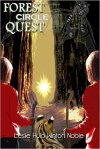
I am never closed to readers’ perceptions, though. I had to modify some of my ideas a good deal on the Forest Circle Quest cover, but the result, in my opinion is now superb.
LikeLike
Feedback and caption done but you’re not getting me to tweet on twitter because then I will be a tweet-faced-twit. 😀
LikeLike
Thanks! You are quite tweet enough ath it ith! 🙂
LikeLike
Awwwww… thank you Col. You are the tweeteth. 😀
LikeLike
LOVE this! =^.^=
LikeLike
Categorically? Yay!
LikeLike
Lovely jubbly little verse;
I can’t rhyme, can only curse!
Little dog, time is marking –
Till the start of Starlight Barking!
Alienora
LikeLike
Looking forward to the rest after the holiday when my time will again belong to me, but it is nice to give the time to the keeping us very busy grandies.
LikeLike
It must be sheer fun all the way!
LikeLike