

The current theme set by Jake gives me an opportunity just too good to miss to pick brains on the subject of what I should think of adding to my proposed book cover for one of the novels I am currently writing, and where to put it. I enjoy a personal involvement in the design of my covers, even if they are ultimately fine-tuned by professionals.
This picture which I took and edited as a ‘working model’ gives a good idea of an important part of the setting, but it leaves the title as the only quick clue to the genre. I have been thinking that it needs more than that – but what? What addition would subtly suggest a ‘fairy-themed’ fantasy adventure to you? Or do you think it would be a mistake to meddle, and that the back cover blurb is enough?
![]()
© Colonialist January 2014 (WordPress)


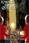


It looks good, though I wonder if the gradient effect is a homage to science fiction, because it reads that way.
LikeLike
I’m at a loss as to how it could be improved upon. I think those “brooding peaks” are wonderful.
LikeLike
I would change the purple font, although I can’t really think of what colour I’d change it to…
LikeLike
That is the problem. Mind you, it isn’t too bad at setting the mood.
LikeLike
AnElephant agrees ‘leave well alone’.
It works.
LikeLike
I appreciate the input!
LikeLike
Not partial to the purple/pink color. Perhaps something darker, if only for the first word.
One other suggestion would be to play with the photo to “simplify” it, making it look more like a drawing or a painting. It might let the text stand out more, and lend a more “magical” look to the cover, and emphasize the setting as being elsewhere.
As usual, just trying to give constructive suggestions. There’s nothing wrong with what you have since once something is done, people will accept it as is.
I’m only throwing out possibilities for alternative looks because you asked.
LikeLike
All of those things are interesting possibilities. The thought of ‘mystifying’ the landscape occurred to me, but as it is a depiction of the reality leading into the other world, that would provide a conflict.
After some experimentation, the darker font colour I would have preferred was found to be too obscure so I settled on the present one for now. If I come across a shade which stands out better but still gives a sombre effect, I’ll certainly use it.
LikeLike
This cover has always worked for me 🙂
LikeLike
Glad to learn that!
LikeLike
I’m a simple cat, of simple taste…(most of the time)
LikeLike
I think what you have is pretty magical.
LikeLike
*gratefully waves wand*
LikeLike
I vote for a hidden fairy on the cover.
LikeLike
An intriguing thought – but if hidden, it wouldn’t be ‘grabbing’ the browser?
LikeLike
Wow I wouldn’t change a thing… I think the message is loud and clear… agree with newsferret,,
LikeLike
I appreciate the opinion – I was fearing that the picture might convey a wrong impression even though it is true to a key scene.
LikeLike
I think the photo is just right for the description of the book… magnificent…
LikeLike
Again, thanks!
LikeLike
I will leave as is. Don’t fine tune.
LikeLike
So you think the message does get across; thanks for the input.
LikeLike