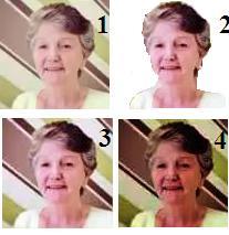
In response to the previous post, Grannymar invited me to play with her Gravatar. In my opinion, the picture is fine. Perhaps the contrast could be improved, though.
Until one thinks about it, one can easily overlook how much of an impression is formed and maintained based purely on the avatar of a blogger. That makes it, actually, a most important aspect of a blog. To illustrate this, it is interesting to note the subtle differences in perception which come across in just four variations of the one shown.
No 1 is the existing Gravatar. Number 2 is an Autocorrect version with the background removed. Number 3 is just the Autocorrect version. Number 4 has the contrast stepped up even more.
To me, Number 3 is ideal. The detail comes out more, but not overwhelmingly, while keeping that background gives an instantly-recognisable feature in the diagonal stripe, which will stand out distinctively even in the smallest formats.
Do you agree? Much Better Half tends to fancy the bold effect of Number 4.


I think the gravatars are fun. I have a friend who changes her every year. I like your new one.
LikeLike
I prefer it when people find their ideal identity and stick to it. The only thing I have done to mine over the years was to improve my smile and take out the background.
LikeLike
I think no. 2 with a solid background in a colour like blue 😉 but what do I know, I’m only an alpaca #hmm
LikeLike
Your alpaca certainly stands out. That makes two who think of a colour background..
LikeLike
I see her face best in number 2.
LikeLike
I think you are right, but the trouble is that this makes it fairly indistinguishable from many other ‘cleaned’ heads, at a quick glance with small format.
LikeLike
number 2, but with a solid colour background as opposed to stripes
LikeLike
That would be an interesting option – but perhaps not as distinctive?
LikeLike
I still think the colour block would be better, the stripes makes me think of the 1970’s
LikeLike
*miffed* The 1970s were great! Nearly as good as the 60s.
LikeLike
LOL! yes they were, but not the stripy fashions and wallpaper of the era. My parents had an horrendous lounge suite covered in large brown shapes that even today makes me cringe 🙂
LikeLike
I have to admit that I never liked those!
LikeLike
Fascinating… I go for the gutsiness of 4 !!! – and the stripes !!
LikeLike
You like a bold statement, and underlined! 🙂
LikeLike
In general I am not a fan of having one’s face on the gravatar. People immediately assume stuff about other people based on their looks.
However, if one insists, I would go with a simple background, and have a photo signifying something more than “hey, this is what I look like”. If one’s passion is flowers, for example, show the person smelling a flower, and so on.
As for the ones above, I don’t see distinct advantages between them, but if forced to choose, I would go with #1 because it is less harsh.
LikeLike
That was the one originally chosen by the blogger, who has now decided to become a lot bolder – but in a different picture.
LikeLike
I know it was the original. The problem with modifying the gravatar is that it should be done with the larger photo (sharpness, contrast, white balance, saturation, etc.) and then reduced to the desired size.
Editing the small photo is not, in my opinion, going to result in an improvement. The original could use a bit of sharpening, and maybe blurring the background a bit, but the other treatments don’t accomplish that, and to my eyes are not an improvement.
But, people choose their own gravatars . . . if she wants bolder, bolder it is.
LikeLike
I will accept that it could have been done a lot more professionally and with better result.
However, it is not only my opinion that the result, after such simple treatment, is a marked improvement.
LikeLike
Not looking to change anyone’s mind; just expressing my opinion, and it’s more from someone into photography than someone evaluating gravatars to fulfil a particular function.
LikeLike
You’ve got a new business/hobby now, Col! Way to fill your time after finishing your last book.
LikeLike
I shouldn’t have let myself be side-tracked. On the book, the real work now starts. The grind part, anyway.
LikeLike
I went to play with my Gravatar and chose a new photo altogether. I did think the old one looked faded, but thought it might be my ageing eyes. I like the way you explained what you did. The original photo was taken by a Geek that I have known for about five years, He met me for coffee one day, but bought me lunch and asked if he could take my photo the diagonal on the wall behind me was his choice.
The photo above is older – a selfie from Oct 2009, seven weeks after my hip replacement!
LikeLike
*sob* Just when I’d got so fond of the other one after working on it – and, you realise, you have just thown away that distinctive stripe! 🙂
LikeLike
But…. can you live with the new me?
LikeLike
The new version is still recognisably the same person, and is strongly and distinctively presented.
After a lot of back-and-forthing between the versions my one reservation about the latest is that it tends to downplay the lighter side of your character we have come to know and love. The expression is almost stern.
LikeLike
If you look closely, there are plenty of stripes (read wrinkles) in this one too.
LikeLike
I also like # 3. Grannymar is lovely. 🙂
LikeLike
And she deserves to be shown to best advantage!
LikeLike
Absolutely. 🙂
LikeLike
No.3 what about mine..can you make me beautiful
LikeLike
You are already! 🙂
Yours might be improved, though, by a slight lessening of contrast.
LikeLike
Ok if I can find out how..I will try it
LikeLike
Easiest is right click source picture to get Open With, choose Microsoft Office Photo Manager, and then Edit and then Brightness and Contrast.
LikeLike
I go for #3.
LikeLike
Mine is a popular choice, it would seem!
LikeLike
I imagine a lot will depend on how 20/20 one’s eyesight is. For me, like you 3 is the one. I figured what the post was about before I read it or scrolled down and picked 3 even before reading. Sorry to your MBH.
LikeLike
It was gratifying to see how well the comparison of pictures illustrated (haha) the point. I was quite surprised myself to see how much difference a simple thing like contrast can make. Your eye, like mine, has been trained by looking at any number of avatars over the years.
LikeLike