

Left – SA edition. Right – USA proof.
Just when I was looking forward to a blogging catch-up of note, an overseas parcel slip arrived – my proof copy of the USA edition of my Regina fantasy. It has shown me, again, that only when one gets the printed copy can one truly assess what the book will be like. After having edited the file time and again and again and again, I am still finding little things in the proof like double full stops and lack of hyphens where they help to make sense, and a sudden switch of chapter headers away from italics – but it looks good nevertheless.
It will be noticed that USA has a larger standard size. Strangely enough, though, the proof still has far more pages than the SA version. At nearly 500 it seems a bit overkill so I have spent today in reformatting to bring it closer to the South African edition of 357 pages.
The redesigned cover does seem quite attractive, though.
Incidentally, it seems totally immoral to me that South Africa demands customs duty on books. Such items really should be exempt.
© Colonialist August 2013 (WordPress)


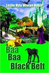


I prefer the SA version – less cluttered, although the colours in the US version are more vibrant. I don’t know – it’s Sunday morning – don’t be asking me to make decisions 🙂
LikeLike
You have a point.- doesn’t make MINE any easier, though! 🙂
LikeLike
The proof looks good Col.
as for customs – this is Africa. Where the government can make money, they will. And the people that are still prepared to spend money on books must obviously be rich, so ream them while you can is probably their motto!!
LikeLike
Anyway, of course, books are something to be lost or destroyed on their way to schoolchildren, one must remember.
LikeLike
Congrats!!!!!!!!!
LikeLike
Fanks!
LikeLike
Wow! Concatulations! This is Pawesome! Both covers look great! =^.^=
LikeLike
Thanks! The second one is the original Tickle, but we were purrsuaded to use a stand-in so as not to steal the scene from Regina. But then, scene-stealing is a cat’s natural right, not so?
LikeLike
Pingback: Really Awful Tweet-tweet | Colonialist's Blog
Plus a different cat? Looks great to me, Col, this must be so exciting!
LikeLike
It was the cat I originally had in mind, but then it seemed it was scene-stealing.
It is!
LikeLike
Basking in your experience as a published author here. What a lovely perspective to read this evening. Wonderful looking cover, Col!
LikeLike
Thanks! Er … but which one?
LikeLike
The final version…though both are nice….
LikeLike
Thanks!
LikeLike
The US cover is MUCH better! I heartily approve of the new fonts, one can read your name much better, and the title has a lot more flash. (Remember one of my original moans was that one can’t really read your name that well on the JD version?)
You know, the text in the SA version is very closely spaced. Maybe take the font size down by a point or two and rather have better line spacing. It’s easier on the eye. Weird though that the US version has 500 pages. Are the margins terribly large? Is the font? I suspect they increased the line spacing, which P’kaboo will probably also do, but 500 pages is a lot.
How is the binding?
Books used to be customs free, I remember my father ordering music from Germany, and not paying customs on it. But of course if a person in government makes such decisions who doesn’t know what a book is…
LikeLike
It is actually only 470 pages, but I think the main fault is double-line spacing. That is too much Times New Roman 12 is a bit large, but easy on the eye. By using 11 it will bring the book thickness to below the average in US – not too good. I used 13 points before, but think 15 is better.
I must load the current version and see how it goes.
LikeLike
470 pages, that is better. No you don’t want to be below the American average thickness. Awr that came out wrong, sorry sorry sorry… 😀
LikeLike
*looks round nervously for any eavesdropping Americans*
LikeLike
hehehehehe!!! You guys! What’ya got against the Cowboys? 😉 (*singing innocently, “pom, pom,pom,peya…”*)
LikeLike
Looks grand!
LikeLike
It does seem most encouraging!
LikeLike
Congrats! It looks great!
LikeLike
Thanks! It certainly does seem attractive, and the interior formatting seems to work well also.
LikeLike
Congrats. Mister N.
I agree on the customs. Disgraceful.
LikeLike
Thanks!
Maybe we should start a petition.
LikeLike
Yeah, why not. Do you have all the relevant details regarding the issue?
Btw. Is this the Amazon (US) version of the book?
LikeLike
Only the bitter fact that one gets clobbered when importing a book or a proof.
Yes, it is. Printed in Virgin Islands, of all places.
LikeLike
How do they transfer royalties if I may ask, Mister N.. There seems no SA facility?
LikeLike
They seem to be able to operate on PayPal or card. One has to do tax declarations etc.
LikeLike
They refuse to pay into my Paypal account. If they do by now, this must be a new development; pls let me know if it’s confirmed.
LikeLike
I will.
LikeLike
Congrats Col, and I agree about the customs duty.
LikeLike
Thanks!
It really is annoying.
LikeLike
May I wish you all the success with this new venture in a new country. 😉
LikeLike
Thank you very much!
LikeLike
Congrats Col and I totally agree with your last sentence. The book looks great my friend. 😀
LikeLike
PS: I like the USA version best. 😀
LikeLike
Thanks for the opinion! It does seem crisper.
LikeLike
It does hey? And I see they used a different cat as well and Regina on her horse looks bigger too. 😀
LikeLike
congratulations – how satisfying for you…
LikeLike
Much appreciated – and it is, but now gives some dilemmas.
LikeLike
I do agree with you on the customs duties charge… books are educational.. but then we toss educational books into dams to cover up people on the take…
LikeLike
Quite so!
LikeLike
I fully agree with the final sentence.
LikeLike
I wish something could be done about it!
LikeLike