
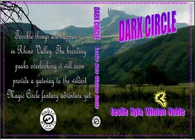
Here is the provisional cover I have evolved for my latest epic, Darx Circle, undergoing final edit. Of course, by modern design standards it is far too ‘fussy’ and completely out of vogue. The publishers will almost certainly impose a different version. Sad, because this is the style I like, and which attracts me.
Compare some of the evolutions of the covers for Terry Pratchett fantasies:


I loved the original Pratchett covers. Fabulous, and the new ones aren’t a patch on them.
LikeLike
I do so wonder whether all the publishing whiz kids are right that the stark simplicity works better? Not for me, they don’t.
LikeLike
I’m probably odd, or maybe because I’m used to covers that often misrepresented what was in the books, but I don’t notice covers a whole lot. I read the summary and the first page or so, and if that does not interests me, the cover is not going to change my mind.
That said, I prefer simple covers. Of the pratchett covers, the second is more appealing than the first or third. But I’m weird . . . you shouldn’t go by what I think.
LikeLike
Even if one isn’t that aware of noticing them, the cover is the first thing one sees when deciding to pick up the book. It is then something one glances at – often with increasing irritation – after each reading session.
You ar unlikely to be unique in your view. The question becomes, which is the majority one!
LikeLike
Hmmm . . . unless the book is on one of the endcaps (usually reserved for publishers who make deals, and only for specific authors), people are going to be doing the neck thing, trying to read the titles sideway, so I respectfully beg to differ; the title/author are going to catch people’s eyes before the cover.
Again, with the cover I am much more likely to be put off than to be pushed toward buying. Hence, an nondescript cover may not be a bad thing. For instance, the first Pratchett cover would turn me off. By the way, despite mountains of recommendations, I’ve yet to read a Pratchett book. Someday . . . maybe . . . but not because or despite the cover.
For reference, of your covers and the side, if I were just looking at the cover I might pick up to read the summary for number 1 and number 4. Then again, those are not likely to be targeting a 61 year old man. And that’s the other aspect of the equation. Unless in your target audience, a lot of the opinions you get may not be pertinent.
LikeLike
Good points all which get me nowhere fast. Maybe I should simply go for a plain wrapper.
LikeLike
That would be novel enough to attract attention. If you are asking which of the three pratchett covers I like, I answered that (no 2).
As for your cover, you mention the publisher will likely want to change it, so I’m not sure what feedback you want.
I think I mentioned before I prefer stylized covers (Tabika comes to mind) which would involve converting from a picture to a drawing.
Otherwise, I’m sorry but I guess I misunderstood what was asked.
LikeLike
No, your answers were on the button. The problem is that there is no simple answer. And even if the publisher has a bright idea, I want enough of an opinion to be able to accept it, or shoot it down flaming wildly, in an educated manner.
LikeLike
I love the cover and like you, I have always been more of a fan of the original Pratchett covers because there was so much to look at !! I know you said simplicity is in vogue, but I was reading somewhere that something small on the cover intrigues a potential reader and makes them click again. Once they’ve clicked and taken that second look…
LikeLike
I like the top one, full of colour and fantasy creatures… it looks the most appealing to me
LikeLike
That’s the way I feel about it – but that style is ‘out of fashion’.
LikeLike
Agreed
LikeLike
Thanks for opinion!
LikeLike
I very much agree with Rosslyns comment. I’d thought about the words in a circle idea, but it will be difficult to pull off.
Basically it is too busy. You have the shadow graduated capped font (I don’t like shadows either), the fancy font on the back, and the twirly pattern around the edge. Where is the eye to look? Oh and the fairy, who looks as though she is something to do with your name.
I don’t like either if the fonts. Visually I find them unattractive, plus they are totally un complementary.
Ark makes a good point about the actual image. Have you got other ones you could use, it doesn’t actually show brooding peaks or a gateway, did you think about using portal rather than gateway? We’ve got a mountain range here in Spain with a gap called Boca de Zaffaraya (boca – mouth) http://www.viewphotos.org/spain/images-city-of-Zafarraya-2934.html
which is more what I imagine from your text.
Like Madhu, I do like the last Pratchett cover. The first is ok, and the second is unattractive.
As with everything, book covers are subject to fashion and whimsical changes.
Now which is the gateway, the text says the brooding peaks will provide it, your comment to Andra says the valley is the gateway. I know I’m being really picky, but it doesn’t hang together. If you want foreboding and peaks I think you need something looming and oppressive. Your pic is more like rolling grassland, some of which is in the shade, with a distant hill that is in the sun.
The cuillens would be another set of peaks that give more of a threat – to me.
http://en.m.wikipedia.org/wiki/Cuillin
Regarding the title, whether you change the font, colour, size, graduation or not, I don’t think it is in the right place. The angle jars with the slope of the hillside. Either line them up, level it, or move it. Other places to put it would be top right in the sky, centre across the sunny peak as it’s not a strong feature anyway, or middle right set in the dark slope.
I like the concept. Or what I think is the concept. I just visualise it differently. At the very least, do change the fonts.
LikeLike
Thanks for the detailed response. In spite of the fact that we are on completely different wavelengths regarding the last Pratchett cover 🙂 you have many valid points.
I have just tried the circle idea for the cover. Frankly, it doesn’t seem to work, and it would also give a problem regarding other covers in the ‘Magic Circle’ series.
I also tried the title on that slope. This makes it look too contrived, and tends to send an unwanted message.
On matters of detail, I think the important thing is for the important elements to stand out first, leaving other things to be discovered – hopefully with pleasure – later. This is part of the motivation for the fonts – I tried various shades including a white to match the back cover for the title and author, but they didn’t work. I would love to come up with the ideal font/colour combination, because I’m also not wholly satisfied with that result. One must remember, of course, that matching front and back is not vital because they would only be seen together if the book is opened and lain flat.
I would not want to substitute any other scene. To me, that picture does have a brooding quality. Don’t you find that? Anyway, the story is set with that particular valley and those peaks playing a linking role throughout. To clarify, the gateways are on that peak and another behind the viewer in that picture, and the valley itself is the site of somoe of the action.
This is my second attempt at this long response – I forgot to save the first, and instead of posting it just vanished.
LikeLike
I figure the circle wouldn’t work. Not with that background. It would need a Pratchett/Meyer type cover. The angle was prob too much to line up the title but the dissonance still jars.
But which is the important element?
Agree that front and back are viewed separately, but still some sort of continuity is always good.
Does the pic brood? No. The point is, you shouldn’t have to explain it to us. The second point is, if you like it, who cares?
Let’s see what happens when you submit it.
LikeLike
The brooding is obviously subjective. It broods to me, and to a number of others, unprompted, who have seen it. So your ‘No’ is over-hasty.
Still, you have reinforced the impression that it still needs a lot of work to work out how to make it all work.
LikeLike
Don’t forget, and you know this, most people like to say yes, great. Etc etc. My no, is just my view. No more, no less.
Keep the pic if you want. Change the front cover font.
LikeLike
I’m the last person to ask… I enjoyed thinking what would I like on my cover and ended up being told it wasn’t good by so many people…. I like yours but then who am I to comment…
LikeLike
Tricky things, covers. In the final analysis, I think that the author does need to be satisfied with what is decided upon. There has to be a compromise between what ‘sells’ and what is true to what the book contains.
Is yours viewable anywhere, yet?
LikeLike
Not yet… reading through for the last time…
LikeLike
I’m with you colonialist – love the detail (that’s what I loved looking at when I was a kid reading fantasy – the details in the picture that you can keep coming back to).
LikeLike
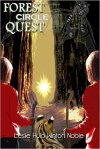
Yes, I think stark covers have severe limitations. I’ve always liked the ones which gave a true insight into some aspect of the book, and hated ones imposed by publishers which have nothing to do with the story. Things like a romance featuring a timid brunette while the cover shows a voluptuous, self-confident blonde put me off completely. Even a ‘snapshot’ of a part of the book which has inaccuracies jars with me. I actually rewrote a scene in Forest Circle Quest so that it would be an accurate reflection of the professionally-produced cover.
LikeLike
It’s a fantasy.
Yes, I realise the setting/location is real. However, in all honesty I don’t reckon the cover reflects this enough. ( little fairy not withstanding)
Tabika immediately tells you it’s about a cat, and the covers on the Immy series immediately identify the content. Girl…Dragon
It’s difficult to compare with the evolving of Pratchett covers as he so blinking well known.
The first cover is a truer reflection of the Discworld, but the last incarnation worksbecause people are aware of who he is and what he writes.
I believe the cover of Dark Circle would benefit a lot from a touch of first edition type Pratchett style artwork. Or something closer to your other books.
Maybe I am so far off base? *shrugs*
If it would sell a million copies you’d probably do a cover featuring a picture of a packet of chips.
I know I would!
You asked… 🙂
LikeLike
Thanks for the considered opinion, which is valued. The fairy was some attempt to give a further clue as to content – how to do that without overdoing things is a problem. I don’t want to sacrifice the background unless I have to, because it is a point of reference which keeps returning in the book. Fonts and all of that jazz can be modified at will – the problem being how best to do it.
I still ask myself – would there be any advantage in Pratchett’s new-style covers over having left the old ones for latest editions? In my case, the opposite is true. If, for any reason, I had never encountered his books, I would be far more likely to consider them now with the original-style covers. I don’t think I’d give the new one more than a passing glance.
LikeLike
Me neither. But he ls famous enough that this wouldn’t be much of an issue. And collectors like different covers and different editions. I know i do.
This was the point I was trying to get across.
Yeah, I know the cat on my book gives little or nothing away about the content, but most people like cats…or can identify/hate them enough to pick up the book! ( he hopes)
The point of reference thingy re your cover is only relevant to you because you know the district and the story.
Is it enough of an attention grabber for those unaware?
Can’t answer for others but personally I can’t relate to it. To me it’s just ”scenery”
The script/colour on the cover looks very 70’s retro.
Not a fan.
How about making the fairy bigger and the ‘scenery’ a background feature…sort of over there ?
LikeLike
In the case of your cover, the cat works together with the title to give a remarkably good preview, actually. At least it sends the imagination on the right lines.
LikeLike
You’re on a roll aren’t you?
I do like the Pratchett cover. Funny because your cat one isn’t dissimilar, it’s clear and striking. Nothing to do with what people think about cats, it is just a good cover.
Scenery is a good description. If you were writing to me you would probably say bland. Anyway off to reply to Cols to mine.
LikeLike
Best of luck. :]
~SAT
LikeLike
Thanks!
LikeLike
I like your design, but I agree that the font and colour could do with some tweaking. At the same time I prefer the final version of Terry Pratchet! 🙂
LikeLike
Are you sure that’s not because you know his books? If you’d never heard of him, would that cover attract you? It does have a stark simplicity, but looks more like a philosophical or medical tome to me than a humorous fantasy.
LikeLike
Reblogged this on Leslie Hyla Winton Noble and commented:
It is time I devoted a blog to promotion of my writing etc.
LikeLike
I’m no expert and not a great reader, so not the best to give advice. When it comes to reading, I prefer ‘simple’ without distraction – the words have a habit of jumping about the page. Light type in a fancy font on a dark background, would put me off and I am not fond of the 3D effect.
With several books already under your belt, you are the expert on what sells, so please do not take offence at my mutterings. Good luck with the buke!
LikeLike
I am no expert on covers, so all remarks are given most careful consideration! Nor can I have any conviction that my own personal preferences would reflect what would be successful for the majority.
LikeLike
I like your cover design. It really does look magical and mysterious.
LikeLike
Yes, I think that picture was perfect. Ever been to a place which (without the Rhino) looks like that?
I think the fonts etc may still need a bit of work.
LikeLike
Like the background photo but the font is too busy, why not put words “Dark Circle” in a circle?
Putting shadow on word is also not good idea.
Back cover words are too big and spaces between lines as well.
LikeLike
Interesting observations. Thank you. The photo is of where I envisaged the action, so that is the only element I would really like to keep. I did try fonts without shadow, of various kinds, and compressed the back cover ones more, but it didn’t seem to work as well, The size is a trade-off for getting the idea across fast while still having the ‘atmostphere’ of a cursive font. I can do some more playing, though.
LikeLike
The pic is great. The font and the purple are not. Happy to go into greater detail if you want.
LikeLike
I want. I do hope to end up with a striking cover, but not at the expense of it not ‘working’. Therefore, any thoughts on improving those aspects would be welcomed. I did try other shades, but they tended to get lost – or be insufficiently dramatic.
LikeLike
I think it look great! However, I don’t think the publishers care about my opinion.
LikeLike
You never know! 🙂
LikeLike
Not my type of book I’m afraid but I think the publishers who after all spend their money on printing the book should know what the public wants. Unfortunately a book IS judged by its cover and it is selling the book that counts, not the author’s personal preferences. I like your design though.
LikeLike
I am absolutely persuaded to go with what sells best (though I draw the line at these covers which actually have nothing whatsoever to do with the book). It is just that I’m not convinced that they have it right with this modern ‘blah’ approach to cover design.
LikeLike
The simpler the better – the fancy 3d typeface makes it difficult to read.
LikeLike
You could be right on that – I notice that all of the Pratchett options had plain lettering.
On the other hand, the lettering is large enough on an actual cover not to present much of a reading problem. Smaller, and it would certainly be better plain.
LikeLike
I think your cover looks great. I also agree with what you wrote about Pratchett, the original design gives the reader a truer insight into Discworld and what the book has to offer.
I hope the publishing goes well 🙂
LikeLike
I’m glad I’m not the only one not totally in favour of the new ‘simple’ vogue.
Thanks! The process has run into delays – but then that always happens!
LikeLike
I think your cover gives a great window into what the book is about. It’s foreboding, but makes me want to read it at the same time.
LikeLike
That is encouragingly in sync with what I was hoping to achieve.. A foreboding quality is definitely what is indicated, because that valley is a gateway for partularly nasty creatures with worst possible ambitions.
LikeLike
I wish you luck with the publisher.
LikeLike
Thanks – I have to accept their judgment, though, which will also be governed by things like limitations in respect of technical aspects and unwillingness to depart from ‘brand’ formats.
Which of the styles might grab you by the wallet?
LikeLike